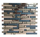
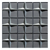
*Main image Source; to visit the link, click here.
London Fashion Week this year was from 16th-20th September 2022. A show of innovation, creativity, and inspiration.
Here at HoM we love to research and keep our eye out for key fashion, interior and design trends. We believe it’s an important (and fun!) project to ensure our products are continually evolving with new and exciting trends.
Below we review Pantone’s Autumn / Winter 2022/23 London Colour Palette, which was released earlier this year within the Fashion Colour Trend Report, which forecasts colours of the season. For each trend we recommend complementary tiles to ensure you’re on-trend this autumn/winter in both fashion and home!
Autumn/Winter 2022/2023 London Colour Palette:
About the Colour Palette, from Pantone; ‘Timeless tones and artful brights embrace our contrasting desire for serenity and stability with energy and excitement.’

From fire-y reds, oranges and yellows, the first part of the colour palette brings bright colours with a hint of purple and green.
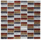
HoM Products including Ibiza, Rio-Remix & Bangkok Linear all bring hints of red, oranges and yellows in similar tones to pantone’s colour range.
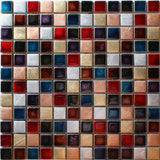
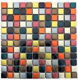
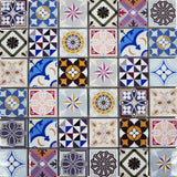
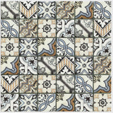
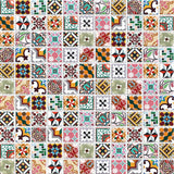
The shade Meadow Violet can be found in the following mosaics: Vintage Moroccan & Camden.

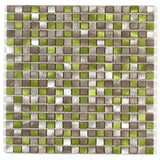
Whilst Abundant Green can be found in the leaves in our Self-Adhesive Mosaic, Tropical Mono:

The second half of the Autumn/Winter 2022/2023 London Colour Palette focuses on more muted colours and earthy tones.

Lichen Blue & Waterspout are both blue shades focusing on the calming serenity of water. Mosaics to match include: Porto, Geo Moroccan Large & Illume Self-Adhesive (for some fun!)
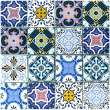
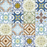

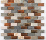
Featuring more earthy tones similar to Chicory Coffee and Cardamom Seed, the following mosaics match: Dylan (see our blog post on complementary mosaic colour palettes for more inspiration, click here to read), Lisbon and Cairns.
About the Autumn/Winter 2022/2023 Core Classics:
About the Colour Palette, from Pantone; ‘Classic, seasonless hues whose versatility express longevity’.

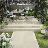
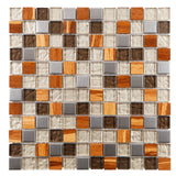
A collection of classic, timeless colours that complement many others and are consistent across seasons. Brown tones from Tapioca and Iced Coffee feature in mosaics mentioned above such as Lisbon, but also in: Copper Antwerp and Outdoor Porcelain tiles such as Sandstone.

The vibrancy of Peach Caramel adds a fun pop of colour, which can be found in previously mentioned mosaics such as Rio Remix, but also Calgary. Pops of Peach Caramel appear in other mosaics such as Geo Blush which features this colour but in a subtle way.
Blueberry and Quiet Shade round up the Core Classics colour palette and bring muted deeper tones. These can be found in the following mosaics: Niagara, Jewel Midnight Blue & Stargazer Grey Luxe.
